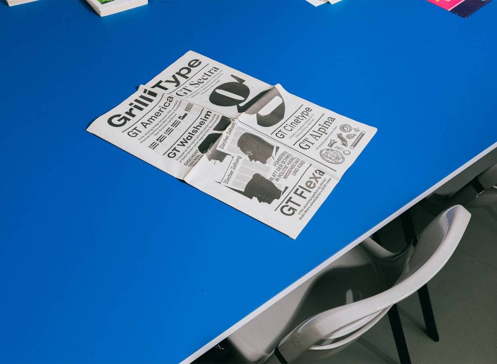
Exploring the tale of a typeface with Grilli Type
Between Swiss rationality and lightheartedness: Type Foundry Grilli Type creates fonts with character and type that conveys meaning beyond the words it spells out. The creators at GT run a type foundry but are at heart graphic designers and all share the love for impactful typefaces. Before his talk at Forward Festival Vienna, we had a talk with Tobias Rechsteiner of Grilli Type about perfectionism, finding original ideas, Comic Sans and the creative process behind their newest strike GT Ultra.
Grilli Type are one of our key speakers at Forward Online Festival!
How would you describe your aesthetics?
We’re a Swiss type foundry, but just because we’re Swiss doesn’t mean we’re neutral. We make type with a point of view, type that conveys meaning beyond the words it spells out. I think we always try to balance the Swiss rationality with a sort of lighthearted wink.
What does an interesting typeface have to have, in your opinion?
What matters to us is this: What story does a typeface tell? What kind of personality does it have? Because we’re graphic designers by trade, we look for typefaces that assist other designers in telling a story. In addition, we see typefaces as tools that can bring subtle nuances to everyday communication.
With typefaces, there are classic ones like Arial and some that get hyped for a short moment, like Comic Sans. Which GT is your favorite one and why?
Even if that landed me in hot waters, I would say that Comic Sans is a classic in its own respect. Of course, since I designed GT Zirkon, I’m biased, but I don’t have a favorite typeface from our library. I think our catalog offers a good mix of typefaces that feel contemporary but, on the other hand, are rooted in classic type design. A good example, in my opinion, is GT Alpina. The typeface can be classified as a transitional serif and is very workhorsey, but it also doesn’t trade personality for efficiency.
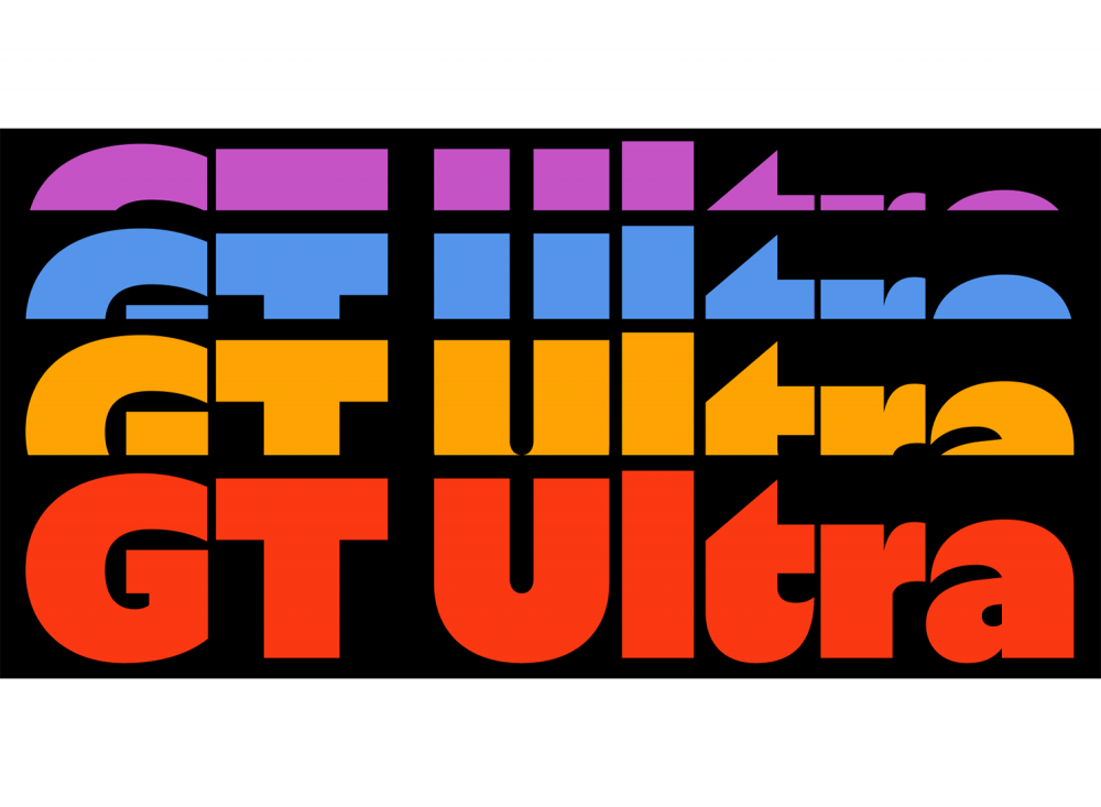
You just released your newest addition to the Grilli Type family – the GT Ultra. What was the core idea behind it?
The process for creating GT Ultra started in 2017 and took about half a decade to complete. Noel wondered how to create a humanist sans serif typeface that would work in a modern and minimalist graphic design environment. He felt that existing typefaces in that genre felt either too flimsy or quirky for what he was looking for. Noel shaped the design to get closer to his vision, starting with calligraphic drawings and removing serifs and ornamental aspects such as ball terminals. He realized that limiting the variety of horizontal proportions by infusing geometric construction principles results in the more rigorous expression he was striving for. Likewise, compressing the vertical proportions made the design more compact and sturdy.
After this first stage, Noel had a version of GT Ultra with very low contrast. He then realized that adding a contrasted version to the mix would be interesting to create a typographic system. To achieve a good weight balance, flared terminals were implemented into the design of the contrasted version. We found this part of the process really interesting, as the design went from a serif to a sans serif that feels like a serif and then to a serif that feels more like a sans.
When creating a new typeface like this one, how do you kick off your research? Where do you get inspiration from?
I think a lot of our processes come from the fact that we’re graphic designers first. We might have an initial idea for a particular shape, and with that in mind, we try out different letterforms. If the sketches remind us of something we might have seen earlier, we’ll examine the root of the style and see how the visual language plays into what we want to convey. Once we arrive at a point where we feel like the typeface has a specific personality, we expand the character set and apply the design decisions to the rest of the character set and see how that plays out.
When creating, do you have a goal in mind, or does that come with the process?
As with many design processes, there’s a lot of back and forth between an initial idea and happy accidents that occur on the way. Significant design decisions can also happen quite late in the process because you find a particular expression of a character interesting which might then get reapplied to the rest of the alphabet. Usually, we all start with an idea for a typeface and then refine the design during the process. Type design works in that respect the same way as any other design process. It’s just a very detail obsessed profession 😀
Creative work is known to be accompanied by a lot of questioning and doubts. So, where do you find motivation and inspiration to move forward?
What helps me most is to do something else for a while and return to the project with some distance, but doubt is a steady companion in creative work, as I’ve learned over the last years. However, there’s a difference between typeface design that you do on your own terms or a commissioned project. In a commissioned project, usually, early in the process, there’s a design decision that you have to take and build upon. There’s not a lot of room for doubt and going back and readjusting. That certainly has a lot to do with experience built over time. But the design for a project of your own is, at least in my experience, still accompanied by doubt, missing motivation, or inspiration at some point. If that happens, just go outside and watch the grass grow, or learn about Japanese tea ceremonies, watch a terrible action movie, or just do administrative tasks.
Personally, I like going bouldering to clear my mind. Then, once you have some distance to the project, you can tackle its challenges again with a decluttered mind. It can help if people start using your early versions of a typeface in real-world projects. It can be a great motivator to push forward and refine the design because you can see the typeface differently.
![]()
How do you differentiate fonts for the analog and digital spheres?
With the rise of ultra-sharp and high-resolution screens, the difference between analog and digital typefaces has definitely become more negligible. However, typefaces used in smaller sizes in UI (User Interface) elements still have different requirements than typefaces used in bigger sizes. Still, ultimately, the requirements for legibility on screens don’t differ so much from analog usage.
What has been your favorite project throughout your career?
Ugh, that’s a difficult question. A favorite recent project is the work we did for Expensify. We were asked to create an entirely fictional alphabet based on GT America for their app for when it’s decrypting messages. The first part of the project was to go back to the Egyptian hieroglyphs and trace how different writing systems developed over the centuries. We also looked at other fictional alphabets like, for example, Futurama’s alien language or Klingon from Star Trek, but those designs felt too outlandish. The characters had to look somewhat familiar, but we had to ensure they wouldn’t be confused with an existing script. We decomposed the Latin uppercase letters into their primary geometric forms and took that as a guiding principle to doodle. I, Katja Schimmel, and the design team from Expensify took some paper and then just drew strange shapes. After that, we selected the most promising letterforms and developed an uppercase alphabet. We refined the drawings and invented the accompanying lowercase characters. The result is fantastic to look at. Some letters could be Latin, Georgian, or Thai. You have the feeling that you recognize the letters, but then this feeling slips away again. The project taught us a lot about the history of writing and the construction of letters.
You are based in Switzerland. To stress the cliché, do you consider yourself a perfectionist?
Grilli Type is based in Switzerland, and I’m Swiss. I do, however, live in Berlin, and I would say that I have a clichéd perfectionist Swiss mindset combined with a certain scrappiness that’s more influenced by Berlin 🙂
What makes you work most effectively? What’s the driving force in your work process?
Learning. I love learning about topics I didn’t know about yet. Even if that means I may not need the knowledge once a project is completed. At least I have some interesting topics for small talk.
If there was anything you could change about the creative industries, what would it be?
I’d say more business knowledge for creatives? Understanding how to price projects and, most notably, how to ask clients for those rates would do a lot for the creative industries overall. I feel like creative professions still undervalue their impact on businesses and society. I also catch myself undervaluing my personal work again and again. If the economic literacy of people in creative professions could be improved through education, it could help reduce a lot of financial stress connected to creative work. But, unfortunately, it wouldn’t solve the problem of questioning or doubting your work.
Tobias Rechsteiner will present Grilli Type at Forward Online Festival. Get your ticket now!