Hannah Witte – graphic designer on a mission
Hannah is a graphic designer, based in Germany. In her work, she creates visual solutions for projects on the subjects of feminism, inclusivity and diversity. We spoke to Hannah about the visibility of marginalized groups in the design context, sharing values with your clients and pole dance.
You’re a custom tailor, after that you studied communication design. Since graduating you focused more on book-design and typography. Could you tell us a bit about your journey?
I remember during my studies of becoming a professional tailor, the drawing lessons were what I enjoyed most, more than the sewing itself. The design processes were most interesting to me. This made me decide to study graphic design afterwards, with a focus on illustration. Eventually I moved more into typography, but I can’t say a specific moment or reason as to why I gravitated towards typo, I just feel like I can express myself better with typography.
Typography appears to be more limited: you have the letters and signs with which you can work and you can reinterpret. Illustration seems to be the more free medium. How would you say you can express yourself better?
With letters, you can illustrate as well. As I don’t do type design, but work with found types and edit them, the process is similar to artists working with found footage material. It’s a lot about language for me as well. To express myself through language has become important to me.
Would you say conceptualizing and writing in relation to typography has become “your medium”?
Yes, I work with language, illustrate with language so to speak. And the medium is typography, giving shape to the image.
Were you already during childhood drawn to creative processes?
As a child, I always said I wanted to become a painter even though I didn’t know what that meant exactly. My parents always supported and encouraged my interest in creativity. I have to say, that going to a Waldorf school was a blessing in the regard that there was a lot of room to explore my creativity. Of course, I understand today’s criticism of the school these days but for me personally, the experience was positive.
What made you decide to get into academia? Was there a moment where you knew you want to study art and deepen your creative journey or was it a rather organic process, leading to university?
It was a very conscious decision. Back in school, I was already looking forward to it. I did a portfolio-preparation course which took a year — I strongly do not recommend that. But the good thing about this was learning you don’t have to study classic art but can do something like graphic design.
Your book Typohacks was made possible through a crowdfunding campaign. How did you come up with the idea? What was the collaboration with FORM like and how did you go about the crowdfunding process?
Initially, it was my Bachelor project. While working on it, I realized how important the subject is and I knew I wanted to publish it to make it accessible to a wider audience. After graduation I looked for publishers and then contacted FORM in the process. They were interested to publish it, however the financial situation was challenging. So and we developed the campaign together. It was incredible complex, but very rewarding in the end.
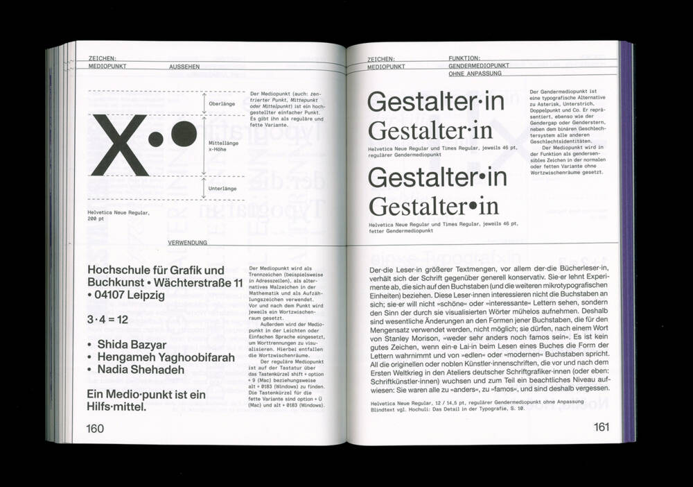
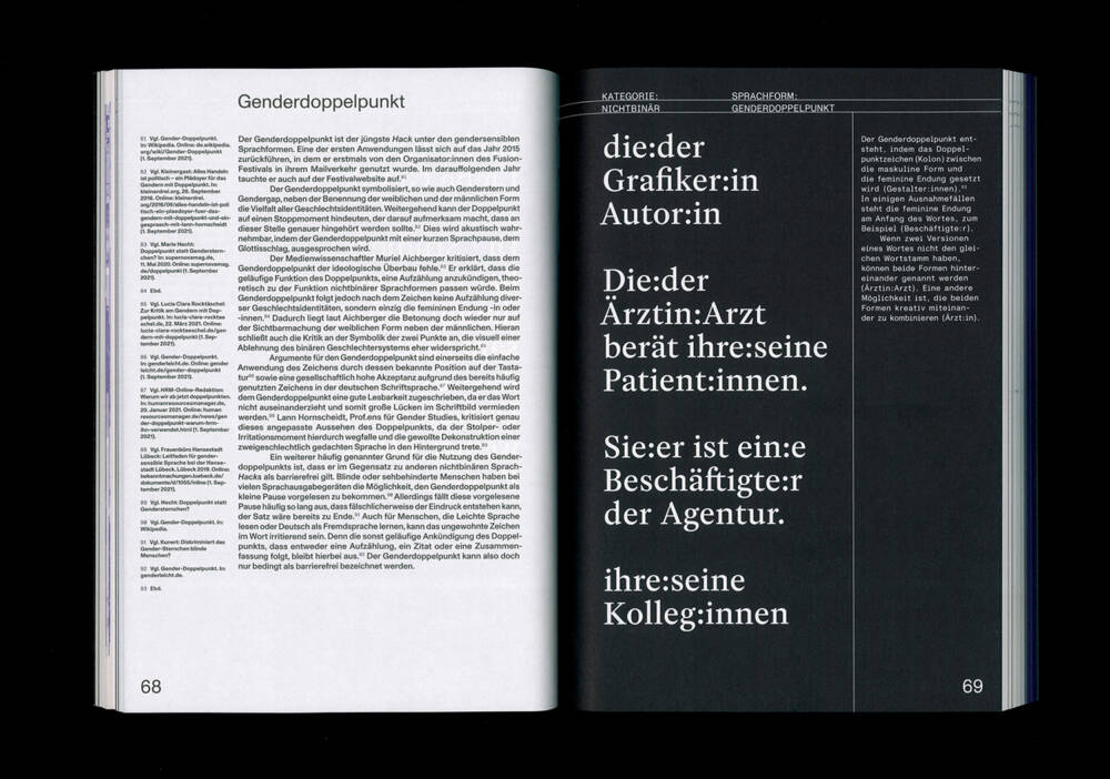
The publication is the first handbook and guide for both: gender-sensitive language and typography. You show anti-discriminatory approaches to typography and text, and show that language is neither one-dimensional nor absolute. It’s a necessary conversation to be had in German speaking countries especially. What inspired you for the project in the first place?
Right, it’s mostly important in German, but also in French, Spanish, Portuguese — I was thinking to do it in other languages, but I since I don’t speak the languages, it’s tricky.
Can you tell us an anecdote where you realized you missed gender sensitive language and typography?
During an internship at a design agency. There was a discussion about gender sensitive language and how it’s not compatible with typography, that it doesn’t look good. This was the moment I thought “why doesn’t anything about this exist?” Starting my research, I was sure I would find some solutions but I only found online typo forums where people discussed the subject matter. People were wondering why designers don’t suggest solutions — since it’s our department, we could develop something. From that I knew I wanted to close this gap and give people an option.
Throughout your — still young — career you won multiple awards and scholarships. Is there one that you’re especially thankful for?
The scholarship of the German Academic Scholarship Foundation. Mainly because of the financial comfort it created and the freedom which comes with it.
Some would argue design can’t change the world. In your case however, one can feel the focus you put on the projects you work on: inclusivity, diversity and education. Would you agree that a good design does in fact have a positive impact on people’s perception of topics?
I would rather say: not only good design has an impact, but graphic design generally always has an impact. In my opinion, graphic designers have a huge political responsibility. In the end, we give the messages and statements of clients visual form, making them visible and making sure that people get them mediated. We decide what exactly is being communicated. Hierarchies play a big role: what should be perceived/read first, what later or not at all. Who is the target group, who should be avoided. Concluding, I would say that the handcraft of graphic design is immensely powerful, making it important to reflect on the content we give shape to.
Do you mainly work on projects whose values you share?
I think it works both ways: clients who don’t share my vision don’t reach out to collaborate, and I don’t reach out to clients whose values I don’t share.
What would you change about the creative industry?
I think designers often struggle with the same issues. The biggest problem is the lack of appreciation for the work we do. More networking, especially of FLINTA* people is something I would love to see. Maybe this is a future project.
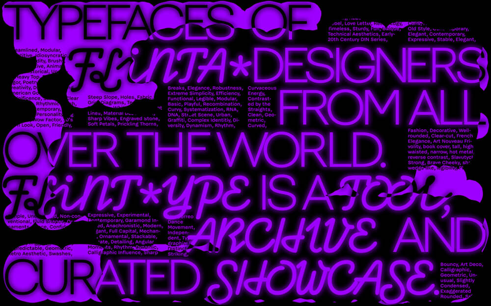
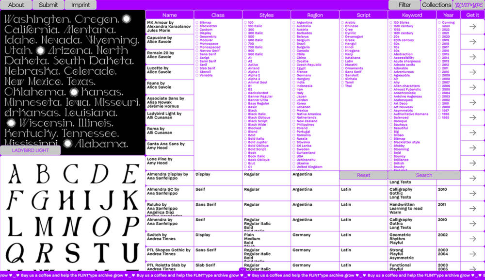
Could you tell us a bit about FLINT*ype, the platform which aims to make typefaces from FLINTA* designers from all over the world more accessible?
This ongoing project is a collaboration with Sophia Krayc, Coco Lobinger, Lilot Kammermeier and myself.
Similar to Typohacks, it was a personal process, turning into something professional. I started to pay attention to the creators of the types I used — whom do I give visibility, who do I pay. I tried to only use types by FLINTA* people or other marginalized groups. Finding the perfect type for a project is a lot of work in general. To then additionally research who was behind it, made the process even more challenging. There were some collections around — like an Adobe collection, featuring type only by women. However, this is a very binary approach. So the four of us decided to create one platform which includes all the existing collections and continues to grow. The special thing about FLINT*ype: it’s not a type foundry, so no website to buy fonts, but a presentational tool, featuring over 400 fonts by now.
What projects are you currently working on? What do you have planned for the future?
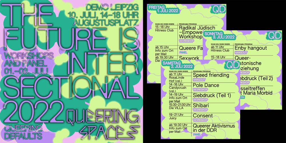
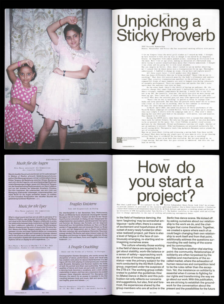
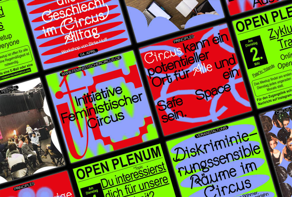
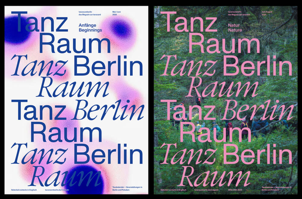
Together with Sophia we started our own little design studio and I absolutely love this. Currently, we work on a dance magazine for the city of Berlin. It’s a very interesting way to get some insights into the performance and dance community. Another project we’re working on is for the “Initiative Feministischer Zirkus”, where we design the new website. It’s interesting to observe that it’s all going in the direction of performance art.
You work both on both, digital creations like websites, and physical objects like books, posters, flyers. What is the difference to you during the design process? Do you prefer one to the other?
I really like both. Of course, the workflow varies. In the beginning its both very similar, but when I work on a print product, things like paper, formats, ink and color have to be considered. Also, with digital projects I’m a bit more free and less limited, regarding moving image etc. But I really do enjoy both.
In your personal life, are you more of a digital person or analog?
It got completely digitalized. But I still have an analog calendar.
Creatives often struggle with doubt and stress. How do you personally deal with that? Is there something you do to get you out of your head? Or are you always on time, always done a week before the deadline?
Not at all. Really good question. And I think this is a topic which should be talked about more often. One thing that really helped me was to realize I enjoy collaborating much more than working alone. It’s more healthy for me, more efficient and more rich for me to work with others. I also notice this now in the studio with Sophia: we’re both self employed but work together on every project. With this, we can split responsibilities. And I really need a counterpart to develop ideas, the exchange. It makes me more relaxed in regards to various jobs.
Another thing is that I stick to a golden rule: never work on weekends. I go to therapy, can only recommend this. And last but not least, a balancing aspect of my life, which gets me out of my head is pole dance.
In your own words: what is your work about?
Feminist and queer topics I have a personal connection to. Societal issues I want to draw attention to. I often create tools for designers which I miss myself.
Image credits: cover and 1st image © Hannah Witte
Image 3,7,10: © Sophia Krayc & Hannah Witte Image 4: © Sophia Krayc, Lea Szramek & Hannah Witte Image 8 and 9: © Lilot Kammermeier, Sophia Krayc, Coco Lobinger & Hannah Witte