Road-sign inspired typeface Montefiore by Colophon Foundry gets a relaunch
Colophon Foundry has re-released its typeface Montefiore, which was first created in 2009 and created a new specimen to sit alongside the launch. “Montefiore was originally drawn in our student days at Brighton University. The road signage in Hove, East Sussex was unlike standardised UK road signage,” explains Colophon.
“It had been rendered from cast metal around the Victorian era. This analogue and idiosyncratic production method produced interesting results. We extended these sketches into a two-weight type family that was originally released in 2009, without an accompanying specimen.”
The foundry, which kindly provided its Basis Grotesque typeface for the Forward Festivals’ booklet and website, recently updated its website and decided to extend the commercial typeface library too. “This includes extensions to other typefaces including Visuelt, Burgess and Aperçu,” Colophon says. “Montefiore felt like a small type family (in terms of weights) that had further possibilities, so we decided to extend it into a six-weight family with further language support.”
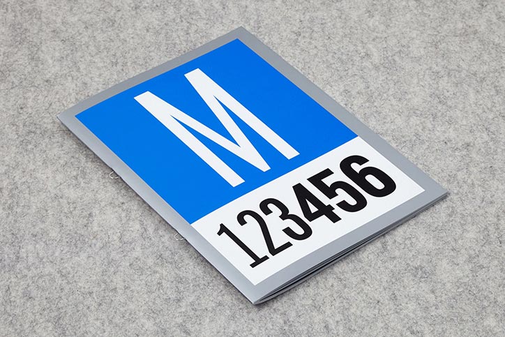
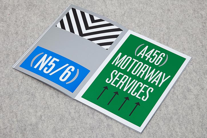
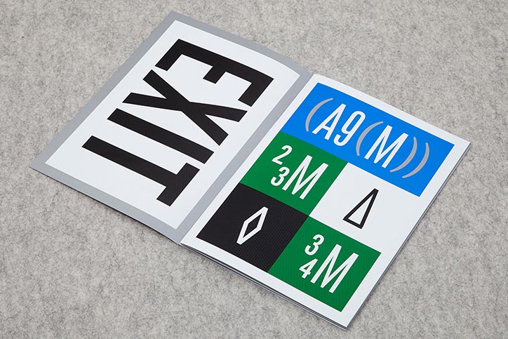
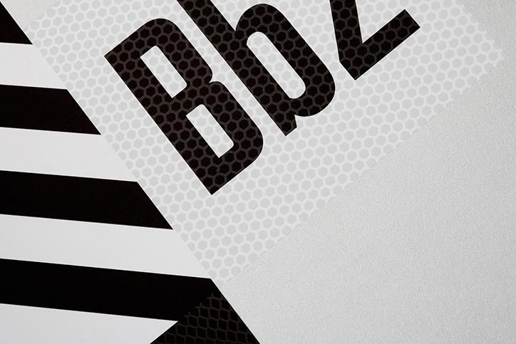
Montefiore is bold and striking, and the different weights give the typeface an elegance not directly associated with road signage, making it sophisticated and modern. To re-contextualise Montefiore’s origins of being inspired by Hove’s road signage, the specimen is an ode to that style. It has been printed by Generation Press in four Pantone colours (silver, black, blue and green) and a “reflective layer” has been added to echo the sheen and texture on the regular road signs.