Snask designs a bold, new identity for Norwegian eyewear brand Kaibosh
Swedish design agency and Forward ‘17 speaker Snask has created an eye-catching identity for Norwegian eyewear brand Kaibosh. The project is comprehensive encompassing a new brand identity, store design and a campaign for the launch.
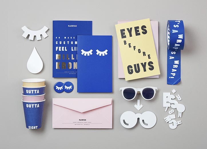
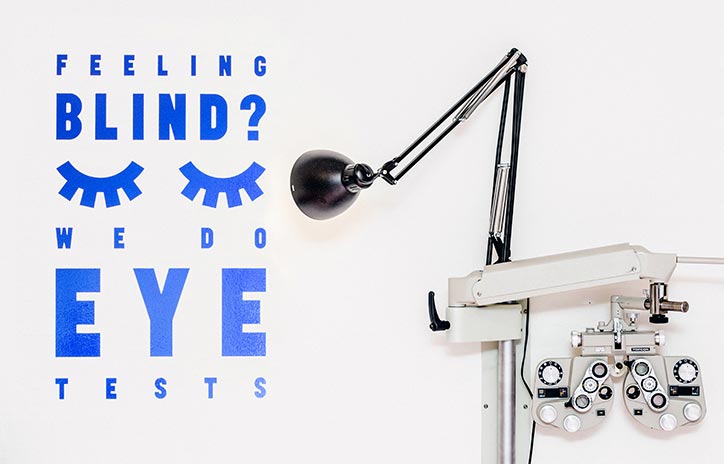
Snask developed a custom typeface and a series of bold icons and logos in blue and white.
“They felt that they had become too boring as opposed to what they should be, a trendy and bold eyewear brand,” says Snask’s Fredrik Öst. “They felt their identity was too clean and they wanted to be more expressive and outgoing.”
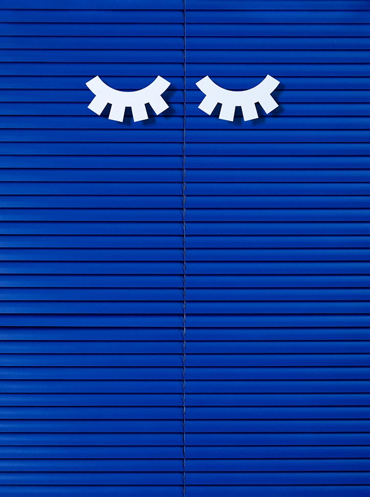
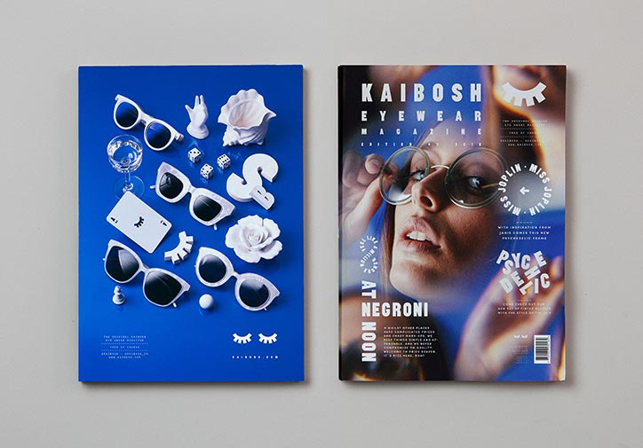
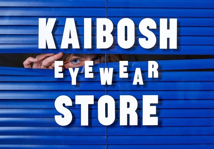
The venture began with an exploration of the brand’s existing platforms and tone of voice that Kaibosh has used so far. “The brand and tonality was translated into visual form and matched with a custom-made display typeface, named Sentrum, made to suit the in-store signage. We added two eyelashes as a symbol to distinguish the identity and to use as graphic elements for many different scenarios,” says the creative director. “We created the entire flagship store with shelving systems, signage, colours, murals, etc. The project ranged from a typeface and still life photos to campaigns, fashion photography, notebooks and towels.”