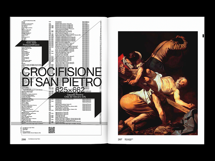
Spot On: Lausanne-based designer Nizar Kazan
Lausanne-based designer Nizar Kazan sees his work as similar to that of an engineer tackling projects as problems to be solved and using materials to compose a solution. “Since I was young I’ve been passionate about things to do with the aeronautics, rail and automotive industry, engineering and philosophy,” explains Nizar.
“I found graphic design was an excellent synthesis of all of that.”
Nizar sees typefaces and type design like any other materials that he can manipulate. “Typography is a sublime, functional and effective material. It communicates by itself a strong identity but its density, curves or eccentricities, even with a limited palette of characters,” he explains.
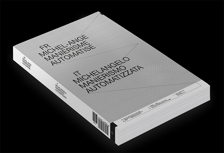
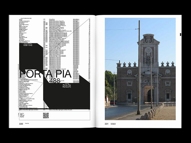
Recent projects include Suisse Quotidienne – Code Civil Suisse, a new edition of the Swiss laws texts with a “poetic approach”, a typeface called Lausanne Regular, an “ultra-organic sans serif font (in response to the historical sans serif)” and a photobook called 500 Views of Airline Liveries tapping into one of Nizar’s passions.
The overarching theme in Nizar’s work is this idea of conveying the rich culture of his native Switzerland. “I like the idea that quality and sharp graphic design are not reserved to a niche market. It can be seen in public spaces and every day through newspapers, biscuit boxes or political posters,” he says.