Exploring the Unique Approach to Design and Typography with Dinamo
Welcome to this interview with Johannes Breyer, Co-Founder and Creative Director at Dinamo. Dinamo is not just a design practice, it is a way of thinking that applies interesting concepts to a wide range of production areas, from typography and design to research and consulting. In this interview, we will delve into what makes Dinamo unique, Johannes Breyer’s favorite typeface, his research process when creating new typefaces, and his advice for freshly graduated students who are interested in typography. Additionally, Breyer will share his perspective on free fonts, the differences between graphic design and typography, and his favorite project throughout his career. We will also discuss what Breyer would change about the creative industries if he could.
What makes the work life at ABC Dinamo unique?
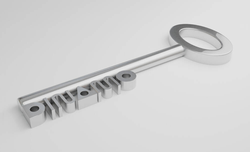
Dinamo feels like a way of thinking rather than being a clear practice limited to one thing. Luckily, we find ourselves in a situation where we can take something we find interesting and apply it to so many different areas of production, from writing and design to technology and objects. It also means we get to work with a wide range of very different people. Right now for instance, we’re working on a keychain for our Dinamo Hardware relaunch. It uses the forms of our Maxi typeface and transforms them into this beautiful metal object, surrounded by shapes from our website. I hope this situation continues for a bit longer!
What do you love most about your job?
The people! Organizing a vast network of super skilled and enthusiastic collaborators.
What do you say to free font websites? Does it make your work harder in any way?
Free fonts can be great, and they make life for lots of people easier. It’s more a question of who produces them and why. When something is for free, you’ve got to ask yourself why it’s for free — and who is ultimately profiting.
What do you think are the differences between simply graphic design and typography? What do you like more about typography?
They have a lot in common but what they have the most in common is that they are a small part of what we’re excited about. We come from a graphic design background, so we bring a graphic designer’s eye to creating typefaces. You could say we’re designers roleplaying as type designers. So far we haven’t been caught.
What does an interesting typeface have to have, in your opinion?
A great story, gorgeous design, and flawless production.
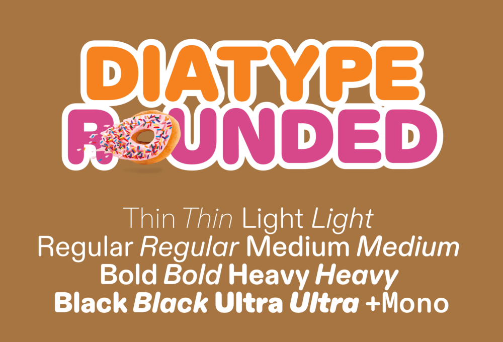
What is currently your favorite typeface?
Diatype Rounded, because it’s so round. And it has a great story 😉
When creating a new typeface, how do you kick off your research? Where do you get inspiration from?
The team is constantly in a process of sharing loose concepts and trying things out together.
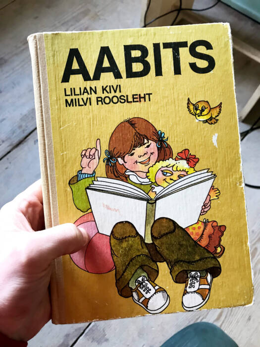
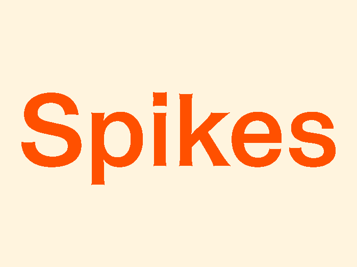
We like to find strange type samples, and improvize on parts of them that we find exciting. Helveesti is based on letters in a vintage children’s book that Fabian found in a secondhand bookstore in Tallinn, for example. It was a Soviet-era clone of Helvetica, with big spiked light traps that would have once helped compensate for blurring in the phototypesetting era. We accentuated them and modernized the typeface. Making the spikes a beautiful design detail in their own right. This process feels very Dinamo to us.
When creating, do you have a goal in mind, or does that come with the process?
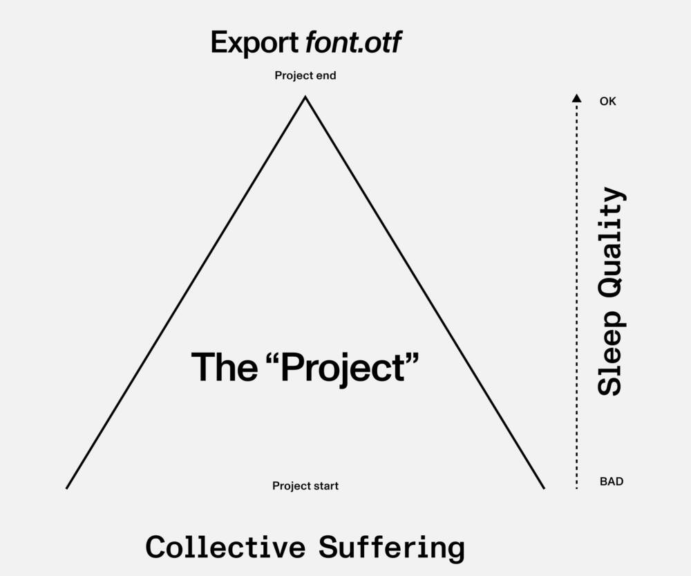
The goal is always to get the font finished without anyone suffering too much (see diagram).
What has been your favorite project throughout your career?
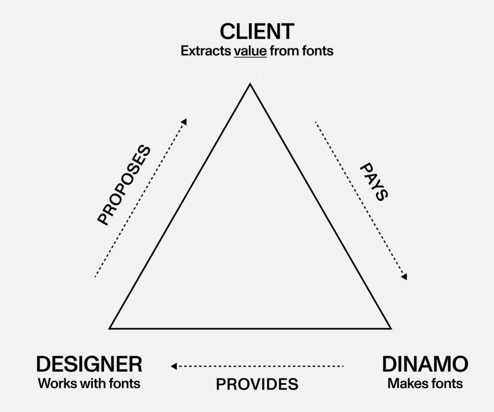
Inventing an entirely new licensing model. We moved away from the traditional use-based system that most foundries use to a value-based model in 2020, because we feel it aligns more with our ethos. Individuals, small companies, and institutions should not have to pay the same price for typefaces as large companies, which often happens with use-based structures. With our new model, companies pay relative to their revenue potential. You can read more about it here.
What would you recommend freshly graduated students, who are interested in typography?
Get your hands on as many typographic references as possible — books, posters, specimens — and trace the characters. Try to understand how they’re built. How a letter’s structure works. Not knowing can be a secret weapon. Don’t think you have to have studied type to be a type designer (we never studied it!). Reach out to foundries like us if you want advice. Begin a typeface and share it with your friends. Get it used even if it’s in a rough state.
If there was anything you could change about the creative industry, what would it be?
It’s hard to pick one thing, as there are so many things that need to change. To name just a few, education needs to be more accessible to everyone. Students and new graduates need more affordable design software and better mentoring opportunities. The industry needs to make sure it’s paying their interns a living wage.
Dinamo will speak at the Forward Festival Berlin in September. Next to him, you will be able to hear Creatives like Studio Feixen, Studio Dumbar // Dept, The Rodina and many more.